Build your own SvelteKit Boilerplate: Style with Tailwind
How to add TailwindCSS to SvelteKit and set our initial layout.
Love it or hate it, we're going to add TailwindCSS to the project.
Let me try to convince you to love it.
<soapbox>
When you start a project by yourself, you know absolutely everything about it. Open that same project next month, you start to wonder what sort of monkey was sitting at your keyboard.
This is true for your application logic, but also your styling. It becomes more apparent when you work with a partner.
Pair program for 15 minutes and you'll discover that stuff you thought was immediately obvious isn't, and stuff you struggle with is clear for them. It's a really powerful technique to get better at programming.
Pair design works the same way, but you have to have a common language to use with your partner. That common language can be pure CSS, but we tend to abstract ideas down to classes. That's what a style sheet is after all.
But now we've got a problem. The second we break out of pure CSS, we are then back to needing a common language and that's where TailwindCSS comes in.
It's a language for utilities commonly used among thousands of developers. It's already been battle-tested against browser support issues, mobile, and whatever else you can think of.
</soapbox>
Adding Tailwind to SvelteKit
This barely needs a section.
npx svelte-add@latest tailwindcss
That's it, we're done. Thanks for watching!
Let's detail what just happened.
That script just added a bunch of files.
app.postcss
This takes care of the base, components, and utilities imports. You can extend your CSS classes here.
__layout.svelte
This is your layout file which we'll be working on quite a bit. It handles your import of the app.postcss.
postcss.config.cjs
This does a lot of Tailwind's postcss processing. It uses autoprefixer, cssnano, and autoprefixer.
tailwind.config.cjs
This is Tailwind's config file itself. You can find out more about these at Tailwindcss.com
You may be wondering about the .cjs it's part of the CommonJS required by Vite.
Alright, enough boilerplate. Let's get coding. Open up tailwind.config.cjs.
Setting up our theme
TailwindCSS comes with a color palette built-in. You don't have to do this step if you're using the JIT compiler, but I like to clearly define my primary and secondary colors.
const colors = require('tailwindcss/colors');

const config = {
    mode: 'jit',
    purge: ['./src/**/*.{html,js,svelte,ts}'],
    theme: {
        colors: {
            transparent: 'transparent',
            white: '#fff',
            primary: colors.cyan,
            secondary: colors.amber,
            gray: colors.trueGray
        },
        extend: {}
    },
    plugins: []
};

module.exports = config;
First, we import the colors. I would bookmark that link. It's a good starting point even if you aren't using Tailwind. Check out what happens if you don't define white.
CssSyntaxError: /src/app.postcss:5:3: The `text-white` class does not exist. If `text-white` is a custom class, make sure it is defined within a `@layer` directive.
This indicates that if you decide to theme your app in this manner you need to define all the colors you want.
Setting up our layout
First, we'll create the files and open up __layout.svelte.
mkdir src/lib/components src/routes/blog
touch src/lib/components/Header.svelte src/lib/components/Footer.svelte
touch src/routes/features.svelte src/routes/pricing.svelte src/routes/login.svelte src/routes/getting-started.svelte src/routes/blog/index.svelte
We did a lot right there so let's unpack it. First, we created two new directories for components and the blog. Next, we created two components to be used in the layout. Last we created our initial Marketing page routes.
Our layout
I probably should have done Mobile-First with this. It's a lot easier to make a site ready for desktop from mobile than vice-versa. Live and learn. And repeat...
// src/rouces/__layout.svelte
<script>
    import '../app.postcss';
    import Header from '$lib/components/Header.svelte';
    import Footer from '$lib/components/Footer.svelte';
</script>

<div class="bg-gray-200 h-full w-full min-h-screen">
    <div class="w-full max-w-screen-xl mx-auto flex flex-col min-h-screen">
        <Header />
        <main class="px-6 flex-1">
            <slot />
        </main>
        <Footer />
    </div>
</div>
We need to import our Header and Footer. We set a reasonable starting point for the application applying a background to the whole app, then making it responsive within.
On to the Header
npm install svelte-hero-icons
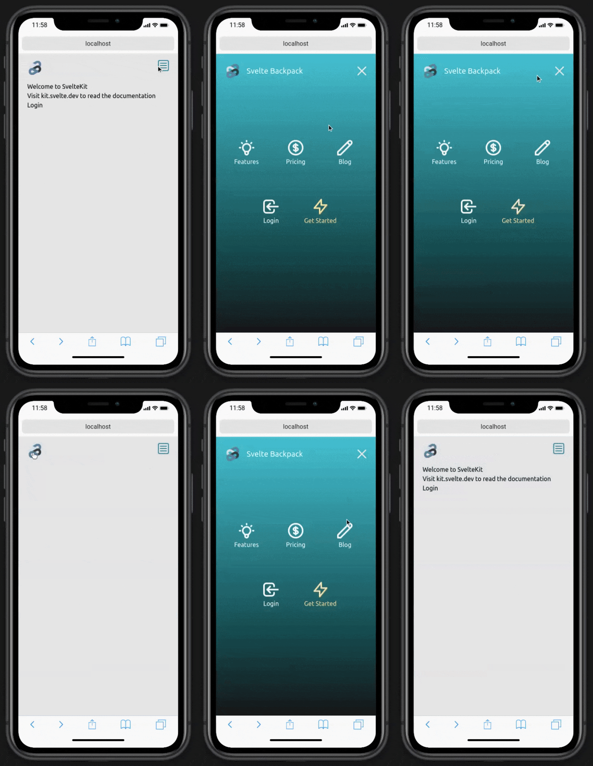
We'll be adding Icons for our Mobile view so let's import HeroIcons wrapped up for Svelte.
Hashnode doesn't really lend itself to the next bit very well. You can check out all of the code here.

To highlight a few things:
- The header is mobile responsive
- You get both Svelte and Tailwind animations
- You get an icon library to choose from
- You can easily add more links if you need
- We're utilizing the Auth service we made in the last one
No one really likes designing Footers
We're going to put in a basic footer as no one really likes designing footers.
// src/lib/components/Footer.svelte
<script>
    import { siteSettings } from '$lib/config/site_config';
    let socialCss = 'h-6 w-full hover:text-gray-500';
</script>

<footer class="px-6 py-6 flex justify-between">
    <span>
        © {new Date().getFullYear()}
        {siteSettings.title}. All rights reserved.
    </span>
    <span class="text-gray-400 flex space-x-2">
        <a href="#">
            <span class="sr-only">Facebook</span>
            <svg
                class={socialCss}
                fill="currentColor"
                role="img"
                viewBox="0 0 24 24"
                xmlns="http://www.w3.org/2000/svg"
                ><title>Facebook</title><path
                    d="M24 12.073c0-6.627-5.373-12-12-12s-12 5.373-12 12c0 5.99 4.388 10.954 10.125 11.854v-8.385H7.078v-3.47h3.047V9.43c0-3.007 1.792-4.669 4.533-4.669 1.312 0 2.686.235 2.686.235v2.953H15.83c-1.491 0-1.956.925-1.956 1.874v2.25h3.328l-.532 3.47h-2.796v8.385C19.612 23.027 24 18.062 24 12.073z"
                /></svg
            >
        </a>
        <a href="#">
            <span class="sr-only">Twitter</span>
            <svg
                class={socialCss}
                fill="currentColor"
                role="img"
                viewBox="0 0 24 24"
                xmlns="http://www.w3.org/2000/svg"
                ><title>Twitter</title><path
                    d="M23.953 4.57a10 10 0 01-2.825.775 4.958 4.958 0 002.163-2.723c-.951.555-2.005.959-3.127 1.184a4.92 4.92 0 00-8.384 4.482C7.69 8.095 4.067 6.13 1.64 3.162a4.822 4.822 0 00-.666 2.475c0 1.71.87 3.213 2.188 4.096a4.904 4.904 0 01-2.228-.616v.06a4.923 4.923 0 003.946 4.827 4.996 4.996 0 01-2.212.085 4.936 4.936 0 004.604 3.417 9.867 9.867 0 01-6.102 2.105c-.39 0-.779-.023-1.17-.067a13.995 13.995 0 007.557 2.209c9.053 0 13.998-7.496 13.998-13.985 0-.21 0-.42-.015-.63A9.935 9.935 0 0024 4.59z"
                /></svg
            >
        </a>
        <a href="#">
            <span class="sr-only">LinkedIn</span>
            <svg
                class={socialCss}
                fill="currentColor"
                role="img"
                viewBox="0 0 24 24"
                xmlns="http://www.w3.org/2000/svg"
                ><title>LinkedIn</title><path
                    d="M20.447 20.452h-3.554v-5.569c0-1.328-.027-3.037-1.852-3.037-1.853 0-2.136 1.445-2.136 2.939v5.667H9.351V9h3.414v1.561h.046c.477-.9 1.637-1.85 3.37-1.85 3.601 0 4.267 2.37 4.267 5.455v6.286zM5.337 7.433c-1.144 0-2.063-.926-2.063-2.065 0-1.138.92-2.063 2.063-2.063 1.14 0 2.064.925 2.064 2.063 0 1.139-.925 2.065-2.064 2.065zm1.782 13.019H3.555V9h3.564v11.452zM22.225 0H1.771C.792 0 0 .774 0 1.729v20.542C0 23.227.792 24 1.771 24h20.451C23.2 24 24 23.227 24 22.271V1.729C24 .774 23.2 0 22.222 0h.003z"
                /></svg
            >
        </a>
    </span>
</footer>
Initial Layout Complete
To recap, we created a layout for the Marketing side of the application, we've made it mobile responsive and are well on our way to having something we can show people.
With a huge sigh of relief, the initial layout is complete. It's a bit bare-bones so we can choose to fill in the marketing pages next or go ahead and pull in another major component. I haven't decided yet.
I would expect your needs might differ from mine. Please let me know what you'd like to see next in this boilerplate at @elliscs or Chris Ellis.
The repo is available at github.com/csellis/svelte-backpack. Feel free to fork, comment, star, etc. Heads up, this is not its final form.
Also, send me a DM if anything was confusing or needs to be reworked.
